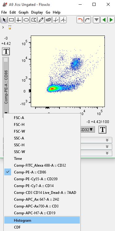
FlowJo v10 makes it easy to convert bivariate dot plots to univariate histograms with a click of a button!

To view your plot as a histogram, simply click the drop-down menu on the left side of the Graph Window and select “Histogram” from the menu.
Use histograms to view frequency distribution of your flow data, one parameter at a time. Histograms display a frequency distribution of the data versus fluorescence intensity or some other parameter (e.g. time, derived parameters). This can be helpful to quickly analyze whether your samples have normal, uniform, bimodal, or other type of distribution. For example, if a live/dead dye (e.g. 7-AAD) was used during staining, you can quickly evaluate whether you have high or low numbers of live cells (live cells will be largely 7-AAD negative).
In contrast to dot plots or other bivariate displays, there are different types of options and gating tools for histograms. See the sections below for more information about histogram options and gating tools.
Histogram Options: Smoothing, Scaling and Color
The histograms can be smoothed (by default) or unsmoothed; this option has little effect when more than a few thousand events are in the gate. Below are the same data-set shown with and without smoothing. (Open Options in the Graph Window and uncheck smooth to show unsmoothed).

*Remember that peak height is a function of the CV (spread) and number of events, so histogram displays can be misleading. It is important to show the frequency or count of the population in a table or on the plot. Normalizing plots to unit area is good for comparison purposes. This can be done in the FlowJo Layout Editor.
Fluorescence intensity is displayed on the X-axis (divided into 256 bins) and the count of events in each fluorescence channel is displayed on the Y-axis. The Y-axis for histograms is the number of cells/events falling within each “bin” of the histogram; there are 256 bins for each histogram which correspond to 256 pixels of display space.

You can manually set the upper limits on the Y axis. The default is to have FlowJo determine the optimal limits. To set these limits, use the Graph Window and open the Options drop down menu (above) and from the Y Axis drop down select Manual. You can then set the upper bounds of the axis units to your desired max (shown above as 2000). It is important to note that the nature of flow cytometry data.

To change the color of the background (default is white) or the tint of the histogram (gray is the default), simply mouse over the color palette squares (see below) and click once. The left palette controls the histogram tint, the right will change the background color.


Histogram Gates.
The gating tools available to histogram displays are available in the upper left side of the Graph Window. There are two options: ranged gates or a bisector tool.
Ranged gates allow you to set a 2 point line as a gate anywhere on the display. To set a ranged gate, click on the ranged gate tool and move your mouse into the display area. Click and drag the mouse simultaneously to set the width of the gate. The gate will be set when you release the mouse button. FlowJo will then prompt you for a gate name (“Ranged gate 1” in my case). Repeat the process to create more gates.

If you need to reset the width of a gate, simply select the gate, mouse over the left or right gate boundary (indicated by a black square) and move it to the left or the right. To move the gate without adjusting the width, first select the gate and move your cursor towards the middle of the gate. The cursor will change from an arrow to a hand. While the cursor is displayed as a hand, click and hold down the mouse button and drag the gate to a new location. Set the gate by releasing the mouse button.
You can adjust histogram gates in the vertical column by selecting the desired gate, scrolling over the gate until the hand cursor appears and then moving the gate up or down. It is often helpful to stagger ranged gates so that you can see how many you have and what they refer to (see the example above).
You can have as many ranged gates as you wish, and they can overlap each other. You can also change the color of the line of the ranged gate(s) as well as add a tint outlining the borders of the gate. To do this first expand the Active Gate menu on the Graph Window and check the tint option box (see below). Select the desired color from the adjacent color palette square. Tinting can be particularly useful for visualizing the separation of ranged gates (e.g. if you do not want to have ranged gates overlapping).

The bisector tool sets two line gates that split the histogram into two parts. Click on the bisector tool and move your mouse over the display area in the graph window. You can move the midline of the bisector tool wherever you wish along the X-axis. Click once to set the gates. FlowJo will automatically assign the names of the gates as the X-axis stain name and “-” or “+” (e.g. CD32-, CD32+). You can always rename the gates in the Workspace by control-clicking (Mac)/ command-clicking (PC) and selecting “Rename” from the pop up menu. If you need to reposition the gates at any time, mouse over the intersection of the bisected gates, click once to engage the midline, and move the gates to a new position. Click once to set the gates.
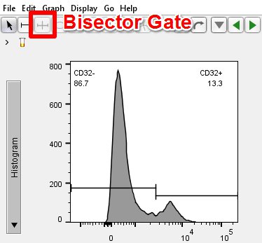
You can only have one bisector gate per histogram, but you may include as many ranged gates with the bisector as you wish.
There are additional preferences that you can set for histograms (e.g. showing histogram gates on 2D plots, line weights, automatic tinting etc.) in the preferences. Default Preferences for a variety of gating and graphing options can be set. Visit Graph Preferences or Gate Preferences for more.
Exporting Histogram Data.
Like all Graph Window display data, histograms and cumulative distribution function (CDF) can be exported as images directly from the Graph Window or from the Layout Editor. However, histograms and CDFs can also be exported as text, which can be used with other graphing programs (e.g. MS Excel, Graphpad Prism).
Click here here to learn how to export histogram data for import into MS Excel, Graphpad Prism, or similar.
If you have further questions about Histograms, please email: flowjosupport@bd.com.