Bivariate density plots are computed the same way as contour plots (equal probability contouring). This algorithm generally generates graphs which are most accurately interpreted by our brains, in terms of relative frequencies of sub-populations. While all contouring algorithms have pros and cons, probability contours have the fewest disadvantages.
There are a couple extra options found in the Options area of the Graph Window that you can apply to density plots to highlight additional information or make visual comparison easier: Smooth and Show Outliers.
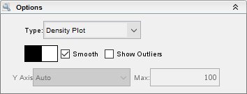
The graphs below show the effect of these options. With smoothing off, every event gets a dot, allowing the graph to display rare events (dots) and high frequency areas (dots of a different color) simultaneously. This shows the data more effectively than a dot plot, which cannot show the relative densities of different high-frequency areas. With smoothing turned on, you can still get rare event information by checking Show Outliers. This will make the 5% of events not included in high-frequency areas visible.
Foreground and background color can also be edited to fit your needs.
You can use the Display Menu to toggle Large Dots on and off.This can be helpful for presentations.
No smoothing

With smoothing and outliers

With smoothing and outliers and large dots

Return to FlowJo Home.