You worked hard for your data, they deserve to look great! The multitude of plot types in FlowJo’s Graph Window provide ample means for showing off your data in their best form.
FlowJo provides several different choices for both bivariate and univariate data displays. The bivariate options can be separated into two broad categories; density plots and dot plots. Univariate displays can be viewed as histograms or cumulative distribution function (CDF) plots. The differences between each of the displays and their associated advantages will be discussed below. For more information on each plot type and how to modify them, click on the associated link within the following sections, or scroll to the bottom of this page to find direct links to the respective pages.
Bivariate Data Display Comparison
FlowJo displays data in the Graph Window as a bivariate pseudocolor plot (default). By changing the type of plot in the options menu of the Graph Window, and further refining the display options, you can explore the wide variety of data visualization FlowJo offers .
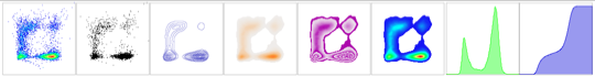
The figure below compares the same set of data using 6 different bivariate plot types.

Density Plots
Density plots provide information about the quantity and fluorescence intensity of events by presenting a display similar to a topographical map. The specifics of each type are described briefly below.
Contour plots use lines to denote the density boundaries. The largest and most inclusive line represents the boundary between the lowest 5% of events and the remaining 95%*. The next line represents the 10/90% boundary, the following line 15/85% and so on.
*The actual percentage depends on the contour line options (5% is the default).
Density plots utilize monochromatic shading, rather than contour lines, to confer information about where the most populous events appear. The darker the shading, the more concentrated the events.
Zebra plots are a hybrid plot, combining properties from both contour and density plots.
Smoothed pseudocolor plots chart density of events by using a spectrum of color. As opposed to density, smoothed psuedocolor plots provide a heat map of bivariate data. Using the visible spectrum as an inverted rubric, high density is indicated towards the red, whereas lower densities occupy the green and blue end of the spectrum. Note: Smoothed pseudocolor plots are simply pseudocolor dot plots that have the “smooth” checkbox marked in the options menu. For more information about pseudocolor plots and their options, click here.
The advantages of density type plots stem primarily from the ability to visualize events that are at or near the chart edges. Small dots can be difficult to see, and darker colors can be obscured by the black lines of the chart edges. Note the events falling on the upper right and left edges in the figure below. The events are easily seen in density plots, but are much harder to visualize on the dot plots (events in red circles/rectangle).

Dot Plots
The Graph Window enables two different dot plot options; pseudocolor (default) and monochromatic dot plot.
Pseudocolor plots confer density information similar to other density plots mentioned above. Using the colors of the rainbow as a heat map, high numbers of events are orange-red, and lower counts are shaded in green and blue.
The lowly monochromatic dot plot hails from the time of the development of the first cytometer (circa 1965). Each dot represents a single event and is presented in the same color. Density information is obscured as more events are displayed. The advantage to viewing the monochromatic dot plot is resolution. Dot plots provide the highest resolution, allowing you to visualize those 5 cells out of a million.
The advantage of using dot plots is the ability to create accurate gates on populations. Density plots imply a general notion of where events occur, but dot plots reveal their specific location. This allows a researcher to draw stringent boundaries between two or more populations that may be in close proximity to one another. For more information on drawing gates, click here.
Univariate Display Comparison
FlowJo’s univariate options include the histogram and cumulative distribution function (CDF). The X parameter is variable with respect to the fluorescent or scatter parameters. The Y parameter is fixed with respect parameters; it can be adjusted for scaling denoting the number (counts) or percentage of events.

Histograms display frequency distribution of flow data. You can think of a histogram as being composed of several adjacent, vertically aligned, narrow rectangles (~1000). Each rectangle’s height represents the cumulative number of events for a narrow range of fluorescence intensity (e.g. rectangle 1 1-100, rectangle 2 101-200, rectangle 3 201-300 etc.). Depending on the data, histograms will take many shapes, but generally the most prominent feature you will witness is a bell shaped curve with a “peak” that represents the modal number. Sometimes more than one peak will be seen (bimodal or multi-modal distribution).

The advantage of viewing a univariate display as a histogram is the ability to visualize modal events (those occurring most frequently), estimating the coefficient of variation (CV), and standard deviation of the curve(s). Gating on the modal population(s) is easiest in a histogram vs. CDF.
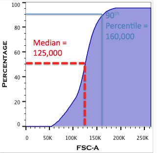
Cumulative distribution function plots display summed information as fluorescence intensity values increase. Exactly analogous to histograms, the CDF plot can be thought of as being composed of several narrow rectangles (see histograms above). The difference is that CDFs tally the number of events in the current rectangle along with ALL of the rectangles to the left. Thus if we’re looking at fluorescence at 10,000 units, the corresponding point on the Y axis is the sum of the fluorescence values present in the rectangles at 9,000 units, 8,000 units, 7,000 units and so on. Often CDFs will present as filled sigmoidal (“S”- shaped) curves. This allows for rapid determination of various statistical values of interest (e.g. median, 90th percentile, 25th percentile, etc.).
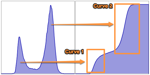
The slope of the line and the number of curves also confers information about the distribution of the data. A steep slope indicates that events are clustered relative to one another, whereas a broad slope reveals a more uniform distribution of data points. More than one sigmoidal curve hints at a bimodal or multimodal distribution of events (see figure below).
CDFs make it easy to visualize the median, or any percentile statistic associated with flow data. Establishing gates based on percentile is facilitated by the CDF. Additionally, overlaid CDFs (created in the Layout Editor) may help visualize small shifts in fluorescence intensity from one sample to the next. This can be a powerful quantitative tool when searching for changes in protein expression after drug treatment(s), as cells differentiate, or after induction of transgenes/ ectopically expressed genes.
For more information on quantifying differences in univariate displays see the Population Comparison platform.
To learn more about the individual plot types, how to adjust their appearance and color, click the following links:
Cumulative Distribution Function
Having trouble with these plots? Send an email to tech support at techsupport [at] flowjo dot com.