Color mapping in FlowJo’s graph window allows users to visualize a third parameter in the two-dimensional display, by illustrating a Median value for any tertiary parameter in a color scale applied to the dots displayed.
Accessing the Color Map
Checking the box for “Color Axis” will display the expression levels of a third parameter represented by different rainbow colors within the graph window:
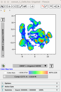

The color axis parameter can be selected using the dropdown list below the color scale. From this list you can choose any acquired or derived parameter associated with the fcs file:

Adjusting the Color Axis
The displayed Color Range is linked to the Transformation scaling range of the selected Color Map Axis parameter. To modify the Transformation range for a given parameter, duplicate the graph window, click the T Button –> Customize Axis option, adjust the top and bottom end ranges for the color axis parameter to remove the white space, or as desired, then click Apply.
After modifying the color axis Transformation, the color axis scale will display the applied Transformation scale range and associated colors. Filling the graph window with the data distribution works well to make the colors pop and see a full range of expression levels represented in different rainbow colors.
If you have any additional questions about color mapping in graph windows (or FlowJo in general), we encourage you to write in to: flowjo@bd.com