SeqGeq provides a wide assortment of tools for the single cell RNA-Sequencing (scRNA-Seq) researcher and/or data analyst. Here we detail one possible workflow, using a particular PBMC expression matrix as an example.
Please note, the direction of this workflow is linear for simplicity’s sake, not due to any constraints of the software. Though many users will likely follow a straight forward SOP similar to this, in which Step One necessarily precedes the next, and so on – The SeqGeq informatics platform is designed to be open ended and iterative for those users doing advanced or non-deterministic studies. One of SeqGeq’s most powerful aspects as an analysis platform is its flexibility and fluidity.
This tutorial utilizes an example PBMC data-set “6K PBMC.csv”, this demo data is provided automatically with the installation of SeqGeq, and is also available here.
Loading Data
To load data into SeqGeq, simply drag and drop your expression matrix into an open SeqGeq workspace, or click the “Add Samples” button, and browse for your sample(s). If you have data stored on the BaseSpace application from Illumina, you can connect to this site and add data directly using a special plugin in the Analyze tab of SeqGeq’s workspace.
Dragging and dropping data into SeqGeq:

SeqGeq is currently compatible with .csv, .txt, .tsv, .tab and .h5 file formats. Detailed documentation for sample import is available here.
Gene Sets
Once you’ve loaded your data files into SeqGeq you may wish to define gene sets of interest within the workspace. In the case of this 6K PBMC data file there is a categorical parameter, “SampleID”, which separates the different samples we combined in order to create the 6,000 event expression matrix. Since this parameter is not one of our genes of interest it can be removed from the gene set which we’ll create to encompass all the genes in this sample.
Creation of a gene set from scratch can be done in few different ways within SeqGeq. For this example start by visiting the Genes tab of SeqGeq’s workspace, click “New Static Gene Set”, click the “Add All” button to add all of the parameters in this sample to the list of Included Genes for this gene set:

Next search for the unwanted “SampleID” parameter, and remove it:

Another useful way to delineate genes of interest is to import a Gene Set directly from a CSV file. A number of hallmark gene sets are conveniently included among the demo files that come with SeqGeq’s installer. These hallmark gene sets may be gathered from previous analyses, your favorite gene set enrichment database, or from sequencing publications. To import some of these gene sets you can simply drag and drop them into the Gene Sets area at the top of SeqGeq’s workspace, or click the Import button within the Genes tab of SeqGeq, browse for your SeqGeq demo files folder, and select the ones you want to include in this workspace:

For more detailed information regarding gene sets, check out this documentation.
Plugins
SeqGeq has the ability to connect to a number of plugins available on The FlowJo Exchange, which extends the functionality of the software beyond the default platforms and tools native to the application. Note, some of these tools rely on software packages which must be installed and set up separately in the R environment.
Detailed documentation on the plugin features in SeqGeq is available here.
Once connected to SeqGeq these plugins are available in the Workspace tab of SeqGeq’s workspace. In this case we’ll begin by running a popular pipeline for scRNA-Seq analysis known as Seurat, and developed by the Satija Lab(1). Fortuitously this tool has been implemented as a plugin in SeqGeq. To run it, simply select a population in the workspace there, and select the plugin of interest:

Having selected this plugin you will need to input some initial threshold and clustering settings, tooltips describing these options are available upon mouse over within that plugin dialog (more specific information available here). Note, you’ll need to select a set of genes on which to run the plugin:

Once calculations are complete (this can take a while), Seurat will generate: a set of clusters within the workspace based on a K-nearest neighbors clustering algorithm, gene sets defining the top differentially expressed (DE) markers within each cluster, a table of p-values for these DE gene sets, a new categorical parameter “Seurat_Clusters” corresponding to those clusters, and a set of tSNE parameters (“tSNE_1_Run_1” and “tSNE_2_Run_1”) in your data matrix. Below we’re visualizing the outputs of that plugin in SeqGeq’s layout editor and graph window:

Note: The tSNE parameters here leave some extra white space in the positive end of the scales, which you might want to remove for better aesthetics. Re-scaling parameters in SeqGeq is very easy, simply click on the “T” button next to either axis in the graph window there, and select Customize Axis:

Another useful plugin is the “AutoCatGate” which automatically creates gates on any parameters with discrete values (Categorical parameters). In this example we can gate the different samples out using that this plugin and the “SampleID” parameter. Simply select the sample, select the AutoCatGate plugin, and choose the SampleID parameter in the resulting dialog:

With the samples identified, we can check how biased the Seurat clustering was performed with regard to each, by creating an overlay in the tSNE map. Since these samples are all healthy human PBMCs (no treatment applied) they should not cluster by sample, so we hope to see a random dispersion of events in tSNE space:

Phenotype Identification
One method for identifying phenotypes in SeqGeq is to color map clusters using hallmark gene sets. To do so, open a graph window of the clusters of interest, in this case we’ll use the tSNE mapping and clusters developed by the Seurat plugin. To color map in the graph window, check the Color Mapping check-box, and select a Gene Set of interest:

As color maps of interest are developed, the populations mapped can be added to a layout. One tip – it can be useful to reference an overlay of unknown clusters in associating these cells with a given phenotype:

*Here we can see Cluster 3 (in light green) is likely B cells; while Cluster 0, Cluster 1, and Cluster 6 are all potential T cell subsets.
Digging Deeper
For the next step, we will use the set of genes defined as top DE by the Seurat plugin. In order to create a gene set which combines all DE genes from Seurat, select them in the gene set area of SeqGeq’s workspace, and in the Genes tab, choose “Union”:

SeqGeq contains tools for performing dimensionality reduction besides this plugin which, among other benefits, allows researchers to run tSNE on subpopulations and gain deeper insights there. In the case of these PBMCs the B cell subset (aka Cluster 3) can be further explored. More information on the dimensionality reduction tools in SeqGeq see this documentation.
For sparse data matrices such as scRNA expression, it is usually advisable to perform principle component analysis (PCA) to condense the data, prior to running tSNE. To do so, select the “Seurat_run_1_Cluster_3” from within the PBMC sample, select “Dimensionality Reduction” in the Analyze tab of the workspace, and choose PCA:

Next name the principal component parameters (PCs) you’re going to create, select the gene set you’d like to use for PCA (the combined Seurat DE Genes for example), and the number of parameters to calculate variance for – typically the default of 12 is more than enough, and you’ll get another chance to choose how many of the PCs are calculated after checking the variance described by a given number, we chose the first 12:

After generating PCs, you can run tSNE mapping with those newly created analytical parameters, this technique of dimensionality reduction is commonly referred to as “PCA guided tSNE”.
For tSNE you’ll want to make sure you select parameters rather than genes, and you may need to run more than one tSNE mapping, having adjusted the settings there for optimal clustering efficiency (mousing over settings will give a tool-tip description of the effect from each):

Once completed you may want to separate different sets of B cell clusters. The Autogate tool in SeqGeq’s graph window can be handy in this regard. It will create a set of gating vertices automatically, based on the density (aka contours) of cells within the graph window:
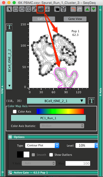
Giving us different populations of B cells, clustered in an unbiased fashion:

As a final example of the power and flexibility available in the SeqGeq informatics platform we’ll define differentially expressed genes for these subsets in two ways, by a DE Genes plugin, and by gating in gene view (aka Pivot analysis).
The DEGenes plugin allows researchers to reference a source population and query differentially expressed genes from another population(s). To run this plugin, simply select your source, in this case the raw sample, select the DEGenesPlugin from within the Plugins section of the Workspace tab, set a threshold of DE, and choose the genes of interest to test:

Once mean expression values are calculated for these genes, within the reference population, you can drag the plugin node to any population for which you’d like to calculate DE, and generate new gene sets:

Another way to discover differentially expressed genes from a population is to view populations of interest in the Gene View tab of the graph window.
To illustrate this, first some preparation is necessary – Select the B cells cluster and generate a Boolean ‘NOT’ population from it:

We can now gate on genes expressed more highly in one of our B cell clusters relative to non-B cells within the Gene View tab of the graph window:

More information on the Pivot analysis is available here.
Differentially Expressed Gene Sets
When assessing Differential Expression of Genes (DEG) a more statistically rigorous method is to utilize the Volcano Plotting tool. This graph can be reached by first opening the Gene View Graph Window. You’ll then want to place your population of interest on the y-axis, and your chosen comparator population on the x-axis (often a Boolean Not gate of the population of interest). Finally click the DEG button at the top of that graph window to open the Volcano Plot:


Once this Volcano plot is visible, you’ll be able to investigate genes there by comparative statistics: Fold Change vs q-Values (aka adjusted p-Values). In order to set cut-offs for a given pair of q-Values and Fold Changes, visit the Graph section of the Volcano plot Graph Window, and select “Manually Enter Gate”:

In this way you can set precise thresholds for both Up and Down regulated gene sets:

These or any other gene sets developed in SeqGeq can then be exported for further gene set enrichment analysis, or publication by copy/paste from the Gene Set Inspector (accessible by double-clicking on a gene set), or via the Export button in the Gene tab of the workspace:

References:
More Info
For further instructions on the use of SeqGeq check out FlowJo University and our list of Webinars.
We anticipate you’ll have lots of questions based on this tutorial, as well as specifics regarding any researcher’s particular analyses, and encourage you to write in for guidance and discussion, here: seqgeq@flowjo.com