One of our most powerful plugins is now native in FlowJo v10.9 or later. Explore populations found through clustering tools using interactive plots displaying population frequencies, marker profiles, and populations overlaid on low-dimension maps. Brand new to v10.10 is the added ability to explore manually gated populations! All images can be copied to the clipboard or FlowJo layout editor.
Launching Cluster Explorer
Cluster Explorer is used after completing dimensionality reduction and population identification (whether through automated clustering or manual gating). To launch the tool, select a parent population that has had clustering or gating performed on it. Then select “Cluster Explorer” from the ribbon in the “Workspace” tab.

After selecting “Cluster Explorer” from the ribbon, a window will appear asking the user to select additional inputs. The window is divided into three sections. At the top, select the clustering output(s) you want to view and compare. Multiple clustering outputs can be selected, but only one can be visualized at a time. To visualize manually gated populations (v10.10 or later), check “Show Populations as a new Cluster set” and click “Configure” to select populations from your sample’s hierarchy. The middle section allows you to pick parameters to visualize. Usually, it is appropriate to choose the compensated parameters. In the bottom section, choose any previously-calculated dimensionality reduction parameters to display the populations on. Multiple sets of dimensionality reduction parameters can be selected.

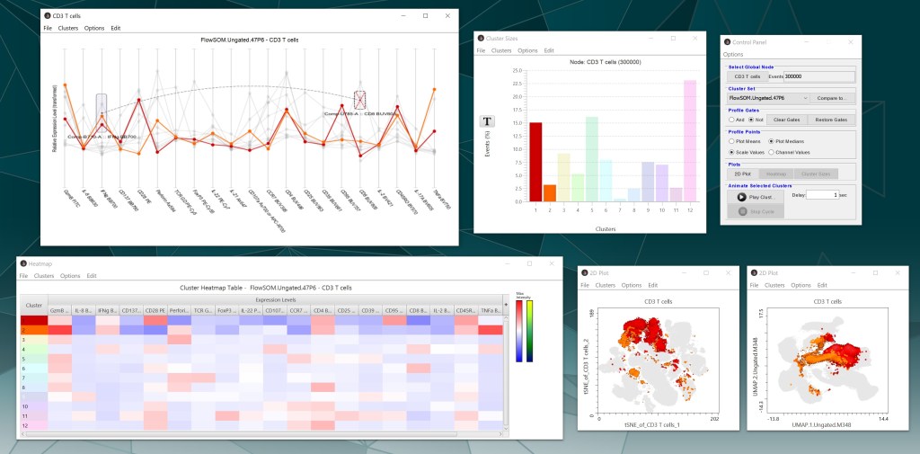
After clicking “Accept”, Cluster Explorer will generate a heatmap, profile graph, bar chart, and the overlaid dimensionality reduction plots for the populations. The control panel provides options for the various pieces of Cluster Explorer, including selecting which parent node and cluster or population set to visualize.

Plot views
The bar chart shows the frequency (%) of each cluster or manually-gated population within the population selected from the workspace. Under “Options”, uncheck “Normalize” to change the display to number of events per cluster. The Transformation (T) button provides log and linear scaling options. Double-click a single bar (population) to change the color of that population throughout the interface. Export displayed values by selecting “Copy content” from the “Edit” tab, then pasting the comma-delimited values into a spreadsheet or text file.

The profile chart shows the relative intensity of each parameter for each population. Each line represents a population, with the color of the line matching the color legend displayed throughout the interface. The “Options” tab contains choices for changing the appearance of the chart. Use the control panel to change profile point values (mean or median, scale or channel). There is an option under the “Clusters” tab at the top of the screen to remove outliers, which will remove cells from the plots whose signal fall outside of certain percentile thresholds. When choosing to remove outliers, it is best to export the entire new cluster set back to the workspace (see note below about merging clusters).

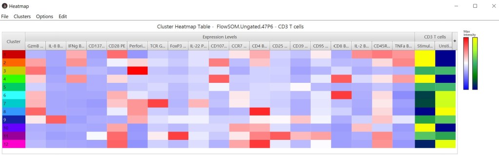
The heatmap shows the relative intensity of each parameter for a given population. Click-and-drag a cluster row or parameter column to rearrange the order. Visualize additional populations in the heatmap by selecting “Add nodes as columns” under the “Options” tab, which displays the frequency of each added node within each cluster. Users can also adjust column sizing and color palettes for the heatmap display. Add or remove parameters to the heatmap using the “+” button on the far right of the plot. Use the control panel to toggle between mean or median values. Hover over a table cell to see the values. To export values, select “Copy content” from the “Edit” tab, then paste the comma-delimited values into a spreadsheet or text file.
If dimensionality reduction parameters are chosen, biaxial plots will also be displayed with clusters overlaid on those maps. Click on either axis to change the parameters being plotted. Other display changes can be made in the “Options” tab. Open new biaxial plots by clicking “2D plot” in the control panel.

All plots are interactive and if a cluster is selected in one plot, that same cluster will be highlighted in the other plots. Double clicking on the white space of any plot will reset which clusters are selected. Capture any plot views by selecting “Copy image” under the “Edit” tab or “Export graphic” under the “File” tab.

Functions
Click-and-drag the mouse over points in the profile plot to form gates around clusters. The “Profile Gates” section of the control panel has options for Boolean logic to select points within the plot. Choose “And” to highlight only the clusters that are within all of the profile plot gates. Choose “Not” to highlight all the clusters not present on the profile plot gates. Select “Clear Gates” to remove any gates drawn on the profile plot and “Restore Gates” to return them to the display.
From any plot, merge clusters (selected manually or by profile gating) under the “Clusters” tab. This will combine all selected clusters into a single new cluster and remove the original individual clusters within Cluster Explorer. In the current Cluster Explorer session, hovering over a newly merged cluster will reveal the original individual clusters that were merged. Undo a merge in the same “Clusters” tab.
Export revised selected clusters or the entire cluster set to your workspace in the “Clusters” tab of the plots. An important note for merging or removing outliers from clusters: After making changes, it is best to export the entire cluster set rather than selected clusters to allow intuitive cluster numbering and easy re-examination in Cluster Explorer. If you choose to export just a selected population(s), upon re-opening the tool, both the original and revised clusters will display, resulting in too many events relative to the global parent node. As an alternative to exporting cluster sets, this issue can also be avoided by deleting clusters that were merged to create a new one or renaming a merged cluster in the workspace after export.

Comparing cluster sets
In the “Cluster Set” section of the control panel, the “Compare to” button will open a new window that allows comparison between different cluster sets. The comparison will try to match clusters (indicated by a red border) that seem to contain similar populations between the two cluster sets. Select one of three similarity metrics to display in the matrix from the “Options tab” (number of mutual events, Jaccard Index, or F-measure). The Jaccard Similarity Measure, at the top of the window, scores the degree of “overlap” between the two cluster sets on a scale from 0 to 1, with higher values indicating more overlap. Export values by selecting “Copy content” from the “Edit” tab, then pasting the comma-delimited values into a spreadsheet or text file.

If you have any questions about Cluster Explorer, reach out to flowjo@bd.com.